How to write that text message in your screenplay.
Text messages in modern stories are pretty much unavoidable now. Write enough screenplays and it’s eventually going to come up.
The Story and Plot Weekly Email is published every Tuesday morning. Don't miss another one.
Text messages in modern stories are pretty much unavoidable now. Write enough screenplays and it’s eventually going to come up.
But like just about everything technical in a screenplay, text messages are clunky to read and disrupt the flow.
I absolutely hate them, and my advice is to find other, more interesting ways to convey information.
But that’s not always an option. And some stories, like last year’s DROP (which I have yet to see!), are ALL ABOUT text messages.
So what then?
Yes, you should worry about it.
I know it’s tempting to say, “whatever” and just throw something down on the page. I get it.
Could a format choice about a stupid text message in the screenplay have any effect on anything?
No, not really.
But also, kind of yes.
It will not create that classic screenwriting scare tactic, “They’ll know you’re an amateur and throw your script away!”
There is no standard way to convey a text message. No one really cares how you do it.
But also yes, because, like anything we do, it affects the read and therefore affects the reader’s experience.
Longtime readers will know how much I emphasize attention to detail.
All of our small choices ADD UP and create a cumulative effect.
Just like 12 extra frames in a scene can make a difference, so can a few extra syllables in a sentence.
Or where a paragraph ends, or a clumsy word structure that forces a reader to go back and reread.
The little things count (and, if you’re like me, something to be enjoyed).
It’s worth noting that filmmakers are facing similar challenges in presenting texts on screen that are interesting and compelling. We’re not the only ones with this problem!
Our three priorities for format and action lines.
In order of importance:
- Clarity of intent.
- Clarity of emotion.
- Ease of the read.
Most forms of text messages clear that first hurdle. We can plainly see that what we are reading is a text message.
But the next two can be much more elusive, especially in terms of the ease of the read.
Here is an example from THE HOLLYWOOD STANDARD, by Christopher Riley.
It’s the best book on screenplay format out there, but I don’t love his way to attack this.
This is fine. It works. It gets the job done. But it’s busy, and I’m not visualizing it as much as I would like.
I’m getting information, but I am not seeing it.
Here is another example that works just fine.
For me, though, it feels like the same problem, maybe worse.
This is definitely more CLEAR, but I am somehow seeing less! It’s odd. It says, “(TEXT),” for goodness sake. What more do you want?
Yet I feel like I am getting dialogue that I know isn't dialogue, which is creating a weird disconnect. I am getting information rather than evoking visuals that provide me the information, like I would in the movie.
(Yes, we are splitting hairs here, but I find the problem-solving of this worthy of my time, and not just because it’s stupid fun.)
This example goes ahead and just plain adds in the SHOT.
I think it works better because of it.
This is much better. The SHOT HEADING helps quite a bit to visualize, as do the italics to distinguish the actual text.
I rarely (I don’t think ever) use the term “INSERT.” That’s there for illustrative purposes.
I usually avoid anything that feels technical or clunky like that. In my own script, I would write ON THE PHONE and let the reader visualize the insert without using the term.
If you want to play it safe, this is what I recommend. The only downside is that it’s a little longer, but I think it’s well worth it if it’s just a few texts. The back-and-forth would get cumbersome fast if you are text-heavy in the screenplay, so use your judgment.
My choice for the next spec script.
For the new spec script going out, I decided to try something new. I wanted something that read quickly, was clearly a text message, and helped the reader visualize the shot.
Was this necessary? It was not. It was just a fun challenge I gave myself.
This is what I came up with:
I created two new elements in Final Draft: “Left Text” and “Right Text.” They have the relative margins you see above.
With some quick research (and according to a couple of places), I determined Apple uses a variation of the “San Francisco” font for the Messages app on the iPhone, so I plugged that into the two new elements.
Hopefully, I am tapping into the reader’s own experience to create a visual of a text exchange.
Again, the goal here is clarity, visualization, and flow. I think it achieves that.
A possible downside.
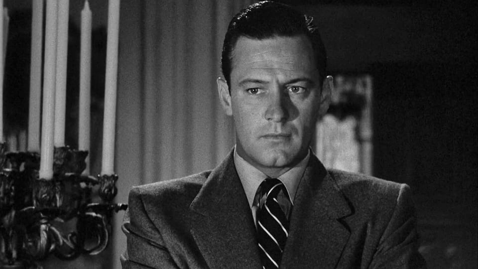
And it’s well worth considering. This is an emotional moment in the screenplay.
It’s an amnesia story, and there is a growing dread that something terrible has happened that he doesn’t know about. Keyes comes home, finds his phone, and sees this exchange. This is when he discovers his wife wants a divorce.
This is an intense moment, and I want it to land. Does this text formatting pull attention from it? Is it too cutesy for its own good, or does it blend in seamlessly like I hope?
I decided that the clarity helped the moment more than it hurt it.
EUPHORIA
After the email was published, reader Jason Kraft emailed me an example he really liked from EUPHORIA.
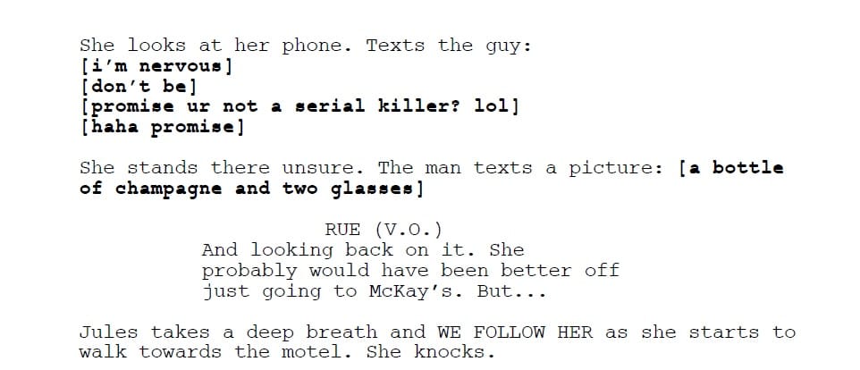
I don't read pro scripts too much anymore unless it's a potential assignment, so it's fun to see how others do it.
I like this example quite a bit as well. It seems to emphasize the quick back-and-forth glibness of a youthful exchange.
It would likely take a little extra effort if there were a dramatic moment from the text, but nothing too difficult.
I think this is very effective and may try it if the screenplay's emotion calls for it.
Just make a choice.
You may read this and think I stress out over format. I absolutely do not. In fact, my message is always the same: do not stress out over format!
Have fun with format. Get away from, “How am I supposed to do this?”
It’s rigid and confining and not worth the anxiety.
The more confident you become, the more you will embrace, “How do I want to do this?”
After that, it's not stress. It's attention to detail.
The key is to be consistent.
However you choose to handle any formatting choice, just remain consistent throughout. In the early parts of your screenplay, you are training a reader how to read your script.
If you break that training, you break a trust with them.
Remember your priorities.
In this order:
- Clarity of intent.
- Clarity of emotion.
- Ease of the read.
If you’re hitting all three, you can’t go wrong.
The Story and Plot Weekly Email is published every Tuesday morning. Don't miss another one.
 Tom Vaughan
When you're ready, these are ways I can help you:
WORK WITH ME 1:1
1-on-1 Coaching | Screenplay Consultation
TAKE A COURSE
Mastering Structure | Idea To Outline